
Reflection
If I were to add on to this project in the future, I would further test my final app designs, to make the interfaces more user-friendly and intuitive. I mainly tested on my early wireframes. I would also create a more consistent text hierarchy within the application, to make it more accessible.
This project was my first experience with maintaining design consistency and brand identity for various products and forms of visual communication. In addition, it was my first time working with Figma. Throughout this project, I learned so much about the design process, and how it is a cycle of iterations and user testing. User testing throughout the process informed my design decisions, and introduced me to new ways of thinking.
Solution
Enhancing the film festival experience with interactive sets and schedule planning.


With the screens above, users can read about the film festival and view the events on all three festival dates (Friday-Sunday, and everyday events). Within each date page, users can view the movie screenings and their descriptions. they can also favorite events of interest.
With the screen on the left, users can view their favorited events and venues on the University of Washington campus. They can also add events to their schedule. With the screen on the right, users can view their schedule, in a chronological listed format, and in a visual format. They can also remove events from their schedule.
Poster Iterations



Festival Map
For my map, I chose to highlight my main three venues by making them the darkest color of my chosen color scheme. In addition, I labeled them with numbers. For streets and walkways, I made them each a different shade of purple to differentiate them from the buildings. For landmarks, I labeled them directly on the map. When choosing exactly what to include, I chose to add buildings and streets closest to my landmarks and venues. I mainly used warmer colors, as I wanted to create a sense of warmth and brightness to match my festival well. My additional locations include information booths and restrooms. I located the information booths near two different entrances into Red Square, as I think this would be helpful for attendees who are entering without having much knowledge about the festival.

Initial Sketches
App Prototype
Low-Fidelity Wireframes
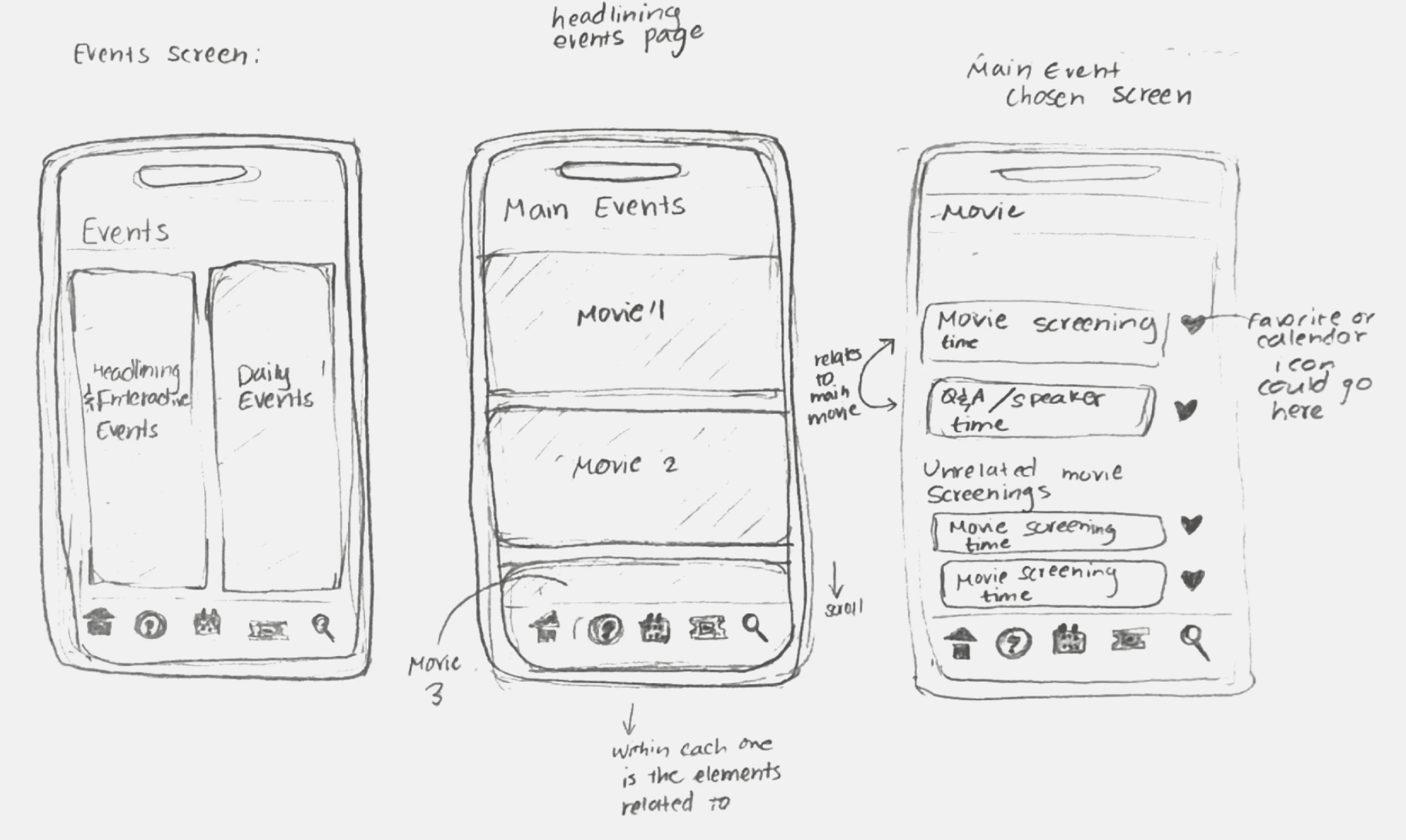

After showing these sketches to a few potential users, I received feedback. Then, I created some low-fidelity wireframes to incorporate the feedback. I was able to refine each page, and to add important features like a search bar, and a more intuitive organization of information.
After creating maps and signage, I moved on to beginning the process of prototyping an app for my festival.
For the main purpose of my app, I focused on schedule planning, which allows users to customize their schedule by favoriting events and venues. For the user flow, I included the ability to favorite events after seeing the day’s events/to search for immersive events.
UI Style Tile
With my chosen task of schedule planning, one screen I have is an event dates screen, which features the three dates of the festival. I would consider using my primary button for a “view events” button which is included with each date.
I would most likely use the secondary button when giving users an option to cancel. For my schedule planning task, this would be right before the user adds an event/event time/venue to their schedule. There would be a primary “add to schedule” button and a “cancel” secondary button.

Icons
I chose five icons [home, help, search, schedule, and tickets]. I wanted the icons to relate to my logomark. To accomplish this I used sharp edges and uneven/imperfect outlines, both of which are similar to my wordmark’s ascenders and shoulders (rounder letters).
Citations (Noun Project): Home - Fabio Nucatolo, Search - Gregor Cresnar, Schedule - Imron Sadewo
Mobile Interface
While designing my app prototype, I made sure to consider my color scheme. This can be seen with the warm yellow color in the background of my screen, icon bar, and the header bar. I used two shades of purple for primary buttons and labels, and blues for secondary information/buttons to convey a sense of harmony (with split complementary colors), excitement, and comfort. I also wanted to convey a sense of adventure and whimsy by making certain features resemble my wordmark. These features include the icons (favorites heart, home, questions, calendar, tickets) and the arrows, plus marks, and x's.
The style of these features and my wordmark font, which each have slight imperfections, relate to the way that stop motion sets are made by hand. I represented the concept of a film made of of thousands of separate frames on my Home Screen as well, where I added images of my logo in a film strip.
Iteration
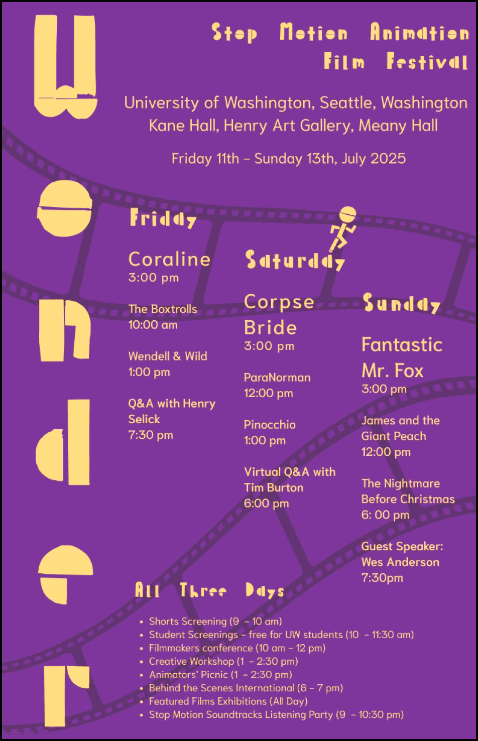
Festival Poster
For my wordmark, I chose the font “Palette Mosaic” and for the font pairing, I chose “Niramit”. I used my wordmark font for the main festival title, the festival subheading, the dates for headline events, and the label for the every day events. The font pairing was used in all other areas, as it is more readable.
I mainly used size to create a hierarchy for my poster. I made the title and subheading, along with other important information (location, dates, headline events) have larger sizes. In addition, I made the festival events that occur on each day of the festival the smallest size on the poster, to make the unique events and important information stand out. For the headlining/main events of the three days, I made the main event of the day larger. Since each main event has a speaker/Q&A event connected to it, I also used a larger weight for these events.
Wonder
Wonder
Wonder
Wonder
Color
Black & White
Logomark Iterations
Mood Board
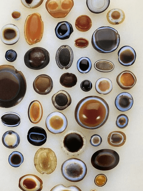
When I think of my festival, I first think of warm colors because my festival is in July. Most of my images include bright colors, mostly red, yellow, blue, and green. These colors create an adventurous feeling similar to the way that stop motion films do.
A few of my images also include stop motion characters, along with behind-the-scenes sets of stop motion films. I included these because they demonstrate the anatomy of the characters well.
In addition, I have two festival posters which both had graphics/typography that reminded me of my Wordmark and the colors that I may choose to include in my festival.





Colors
I wanted to convey a feeling of comfort, excitement, and harmony. To accomplish this, I chose a Split complementary color palette, which features various shades/tints of yellow, blue, and purple. With these colors I chose, I made sure they had a more warm temperature if possible.
The color scheme creates a sense of warmth and comfort with its temperature, and it creates a sense of excitement with some of the more saturated yellows and purples/pinks. The blue creates a sense of harmony, as it is close to purple on the color wheel, and it complements yellow.
Color Name: Cream Can
Hex Code: FCCA71
Color Name: Sapphire
Hex Code: 4557A4
Color Name: Voodoo
Hex Code: 663D72
Color Name: Lucky Point
Hex Code: 2A2A7C
Color Name: Yellow Sea
Hex Code: FDAB26
Color Name: Remy
Hex Code: FEEAF8
Primary
Secondary
Tertiary
Contrast Accessibility
Contrast Ratio 5.76 : 1
Contrast Ratio 6.41 : 1
Color Name: Medium Red Violet
Hex Code: B9298E
Color Name: Vivid Violet
Hex Code: 823E9D
Color Name: French Rose
Hex Code: F04C8E
Ideation
Wordmark
The word wonder is “a feeling of surprise mingled with admiration, caused by something beautiful, unexpected, unfamiliar or inexplicable” (Oxford Languages). When I watch stop-motion films, I feel a sense of wonder at the cinematic worlds created.
I wanted to convey feelings of whimsy, simplicity, and adventure, as my festival aims to make the stop-motion experience more immersive -- with life-size interactive sets. I hope that attendees are able to feel a sense of joy and adventure that they may not feel by simply watching the films.
I chose Palette Mosaic, which is a sans-serif font. The font uses the combination of primitive shapes instead of counters (visible with letters ‘o’, ‘d’, and ‘e’), which creates a sense of craftsmanship. Stop-motion films are made with craftsmanship, with each of the setting and character created by hand.
For my initial research, I looked into three different film festivals:
Research


Each festival was either focused on regular animation or stop-motion animation. I was able to see a wide range of animation film festivals. A key takeaway from this research was that there was not as much information about the stop-motion animation film festivals.
Personas
I created three different personas, each with different interests and goals related to the festival. To do this, I
spoke with peers and family members who had an interest in the festival. I was able to learn about their experiences and backstory, which allowed me to understand their motivations in going to this festival.
I was to design the visual communication for a festival on the University of Washington campus, in 10 weeks. I created this project as part of the HCDE 308 course at UW. I chose to design a film festival, more specifically, a festival focused on stop motion animated films.
Core Value Proposition
Unique Selling Point
My idea for a festival is a stop motion animation festival in Seattle. For film and animation enthusiasts, who want an opportunity to practice their creativity, my idea provides 3 days of workshops, guided activities, and screenings of stop motion films.
Unlike other animation festivals with a primary focus on film-watching, my idea provides attendees with the opportunity to immerse themselves in the environment of the films they watch, through the use of interactive life-size film sets.
Context
Simone Chadha
UX/UI Designer, UX Researcher, Product Designer
10 weeks
September 2024 - December 2024
Figma
Team
Duration
Tools
My Role
Filling the summer with Wonder: Immersing viewers into the worlds of Stop Motion Films